
Figures
As mentioned before, your results section should be as visual as possible. Tables and graphs can give the audience a clear overview of any quantitative data you acquired. Make sure your audience can understand them independently of your spoken words. For example, graphs always need axes titles and, if necessary, a legend that explains all the symbology used (see figure). When you first mention a graph or figure always start with describing the axes. As before, make sure your figures are clear (not too cluttered) and legible for people in the back of the room as well.
A useful way to make figures and graphs scalable while keeping them high quality is to use vector figures (see Visualisation module). These figures can be exported with different font sizes while the graphics and illustrations remain sharp. In this way you can ensure you maintain high resolution regardless of the size of the image.
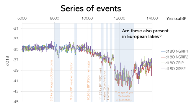
Example of a self-made graph (based on data of Rasmussen et al. 2007) with highlighted sections and non-generic excel settings. An example of a follow-up question to introduce the next slide is also given. Slide and graph: Stan Schouten
